Code
library(jsmp)
library(broom)
library(bestNormalize)
set.seed(1)

n <- 1000
scale <- 50000
dfo <- tibble(
  q = sample(0:100, n, replace = T),
  value = scale * 1.03^q
)
ggplot(dfo, aes(x = q, y = value)) +
  geom_point(size = 1)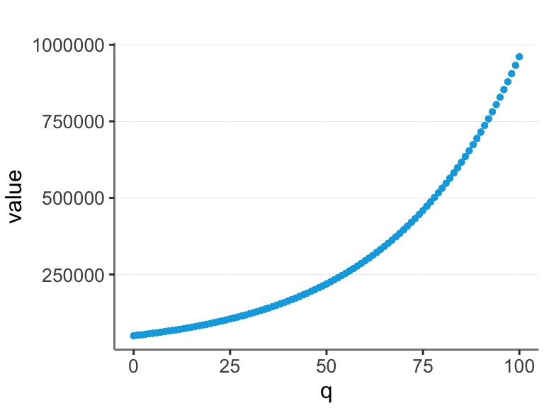
Often real data is exponential. For example, let’s say that the base value of a company is $50,000, and it increases by 3% for each unit of quality (q).
library(jsmp)
library(broom)
library(bestNormalize)
set.seed(1)
n <- 1000
scale <- 50000
dfo <- tibble(
q = sample(0:100, n, replace = T),
value = scale * 1.03^q
)
ggplot(dfo, aes(x = q, y = value)) +
geom_point(size = 1)
Assume we are not aware of this, and we are trying to model q / value relationship from the data. Then we could log transform the value and make a linear model.
ggplot(dfo, aes(x = q, y = log(value))) +
  geom_point(size = 1)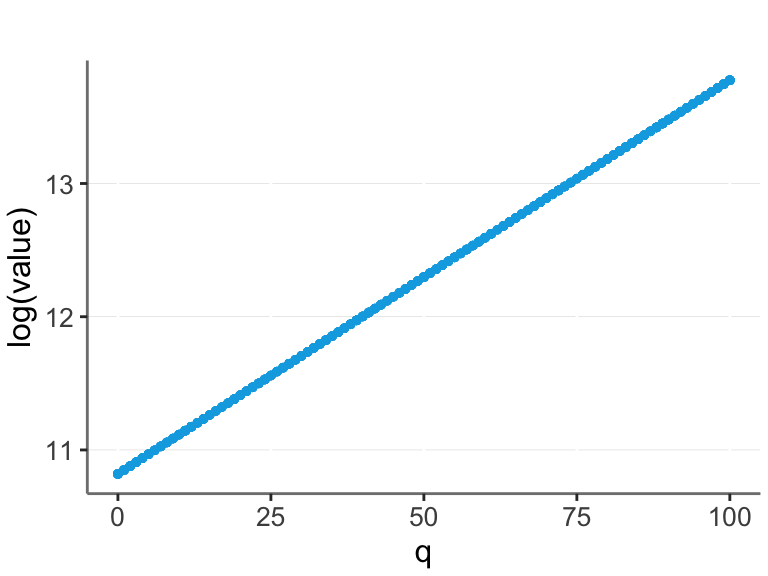
In this case we have a perfect straight line, and thus optimal prediction with a linear model.
But in real life there is often noise. Here I add some random noise to the data, and also set all negative values to 0. (Another common feature of real life data.)
add_error <- function(df){
  df %>% mutate(
    e1 = rnorm(n, 0, 10),
    e2 = runif(n, -2*scale, 2*scale),
    ye0 = scale * 1.03^(q + e1) + e2,
    value = ifelse(ye0 < 0, 0, ye0))
}
df <- dfo %>% add_error()
ggplot(df, aes(x = q, y = value)) +
  geom_point(size = 1, alpha = 0.5)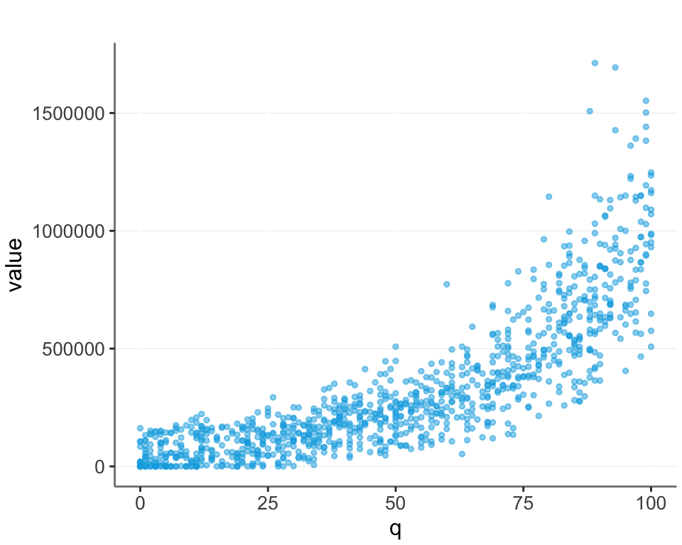
What is the best transformation in such real life cases?
We cannot simply perform a log transformation, since we can’t take the log of 0. A common approach is then to take the log of value + 1. Alternatively we could make another transformation, such as taking the square root or another root. Another possibility is to try and guess the scale (which in this case is the base value of $50,000 we set). I plot this as “log_plus_scale”.
Additionally I look at the inverse hyperbolic sine transformation, and the yeo_johnson transformation. (Note, the Yeo-Johnson transformation is an extension of the Box-Cox transformation that can handle zeros.)
Let’s look at these models applied to the data without noise.
get_transformations <- function(df) {
  df %>% mutate(
    untransformed = value,
    log_plus1 = log1p(value),
    log_plus_scale = log(value + scale),
    square_root = value^(1/2),
    power_1_4 = value^(1/4),
    inverse_hyperbolic_sine = log(value + sqrt(value ^ 2 + 1)),
    yeo_johnson = predict(yeojohnson(value))
    )
}
plotit <- function(df){
  df %>% pivot_longer(
    c(untransformed, log_plus1, log_plus_scale, power_1_4, square_root, inverse_hyperbolic_sine, yeo_johnson),
    names_to = "transformation", values_to = "transformed_value") %>%
  ggplot(aes(x = q, y = transformed_value)) +
  geom_point(alpha = 0.5, size = 1) +
  geom_smooth(method = "lm", formula = y ~ x) +
  facet_wrap(~transformation, scales = "free")
}
dfo %<>%  get_transformations()
plotit(dfo)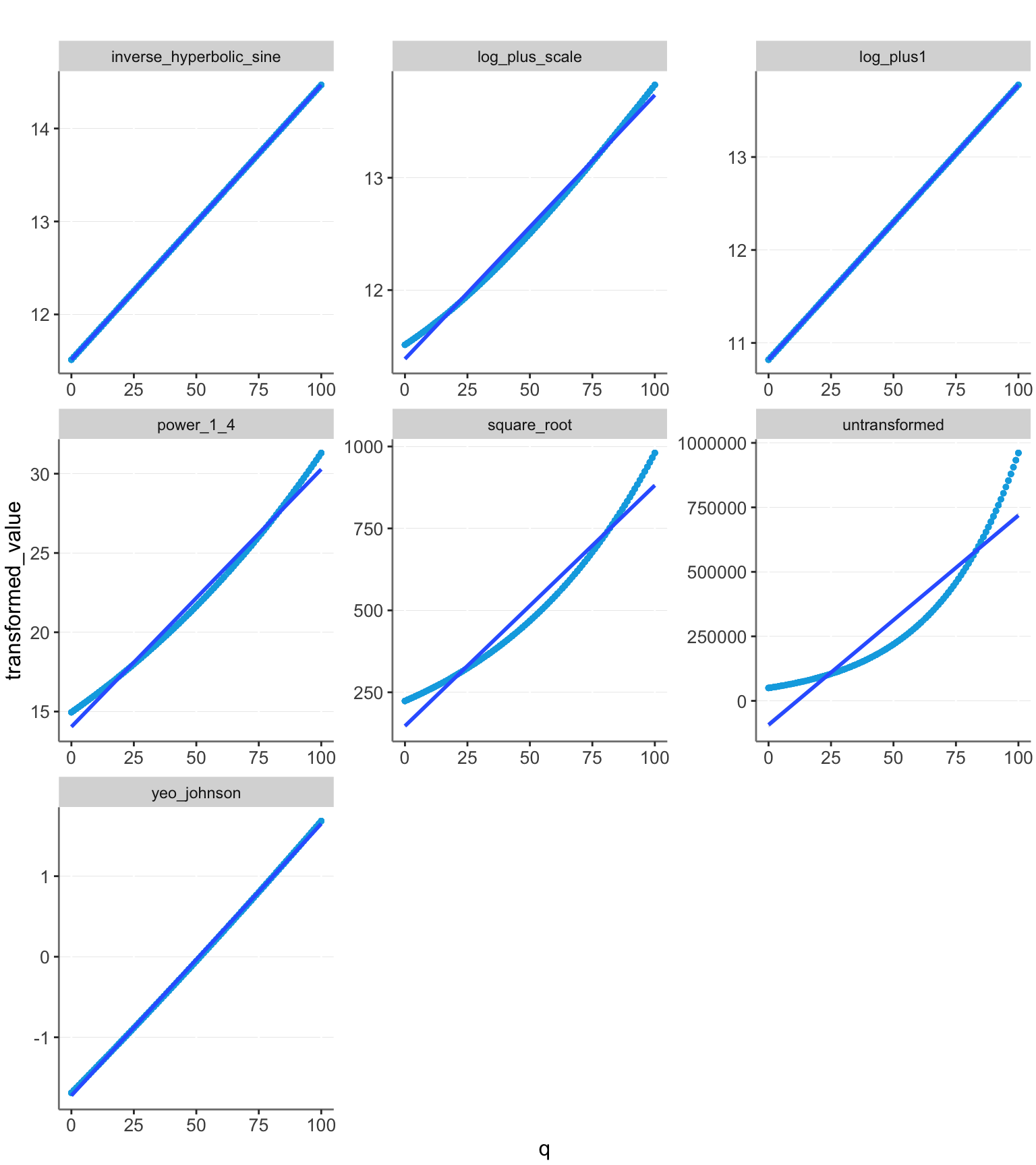
Log + 1 fits exactly on the line and thus gives us perfect prediction. The other models have some deviation. The untransformed model is clearly a worse fit than the others, stressing the importance of transforming the data.
A way of quantifying the prediction strength is by looking at the R2 values.
get_r2 <- function(f, df) {lm(f, df) %>% glance() %>% pull(r.squared)}
calc_r2 <- function(df){
  tibble(
    transformation = c(
      "q ~ untransformed",
      "q ~ log_plus1",
      "q ~ log_plus_scale",
      "q ~ square_root",
      "q ~ power_1_4",
      "q ~ inverse_hyperbolic_sine",
      "q ~ yeo_johnson")) %>%
    rowwise() |>
    mutate("R<sup>2</sup>" = get_r2(transformation, df))
}
calc_r2(dfo)| transformation | R2 |
|---|---|
| q ~ untransformed | 0.879 |
| q ~ log_plus1 | 1 |
| q ~ log_plus_scale | 0.9943 |
| q ~ square_root | 0.9648 |
| q ~ power_1_4 | 0.9908 |
| q ~ inverse_hyperbolic_sine | 1 |
| q ~ yeo_johnson | 0.9997 |
All the transformations have a good fit for the data without noise added, with the log models performing best.
Now let’s look at their performance when we add noise.
df <- df |> get_transformations()
plotit(df)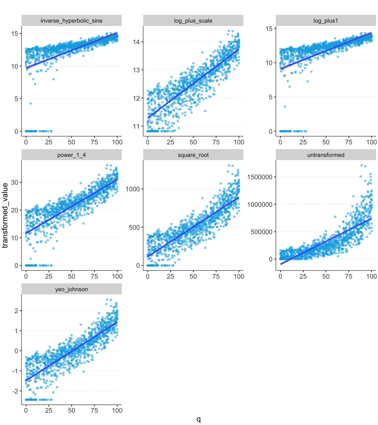
Here we see that the log_plus1 model has a large deviation from linear caused by the 0 values. The other models perform better here. We can also see this quantified with the R2 values:
calc_r2(df)| transformation | R2 |
|---|---|
| q ~ untransformed | 0.67 |
| q ~ log_plus1 | 0.3346 |
| q ~ log_plus_scale | 0.761 |
| q ~ square_root | 0.7577 |
| q ~ power_1_4 | 0.6652 |
| q ~ inverse_hyperbolic_sine | 0.3213 |
| q ~ yeo_johnson | 0.7364 |
The log_plus_scale transformation still performs well. However, we have also assumed that we have created a perfect guess about the correct base value of $50,000. The other transformations may be more appealing, since they do not rely on this accurate guess. However, their performance may vary depending on the data range. Let’s try extending the range of q values and see what happens.
df <- tibble(
  q = sample(0:300, n, replace = T),
  y = scale * 1.03^q
) %>% add_error() %>%
  get_transformations()
df %>% plotit()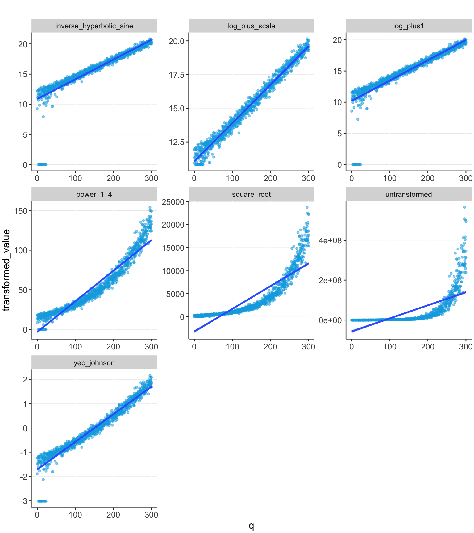
calc_r2(df)| transformation | R2 |
|---|---|
| q ~ untransformed | 0.4801 |
| q ~ log_plus1 | 0.8292 |
| q ~ log_plus_scale | 0.982 |
| q ~ square_root | 0.7511 |
| q ~ power_1_4 | 0.9128 |
| q ~ inverse_hyperbolic_sine | 0.8147 |
| q ~ yeo_johnson | 0.9475 |
We see that with this larger data range, the strong transformations perform well, and not transforming the data performs very poorly.
The common method of transforming using log(value + 1) can be inaccurate, if the scale of the data is large.
The best transformations are either guessing the scale and using log(value + scale) or performing the Yeo-Johnson transformation.
Of these, guessing the scale can achieve slightly higher accuracy. However, the Yeo-Johnson transformation is likely often preferable, as it doesn’t rely on having to make an accurate guess.